LOFT中国感谢来自 季意空间设计 的餐饮项目案例分享:
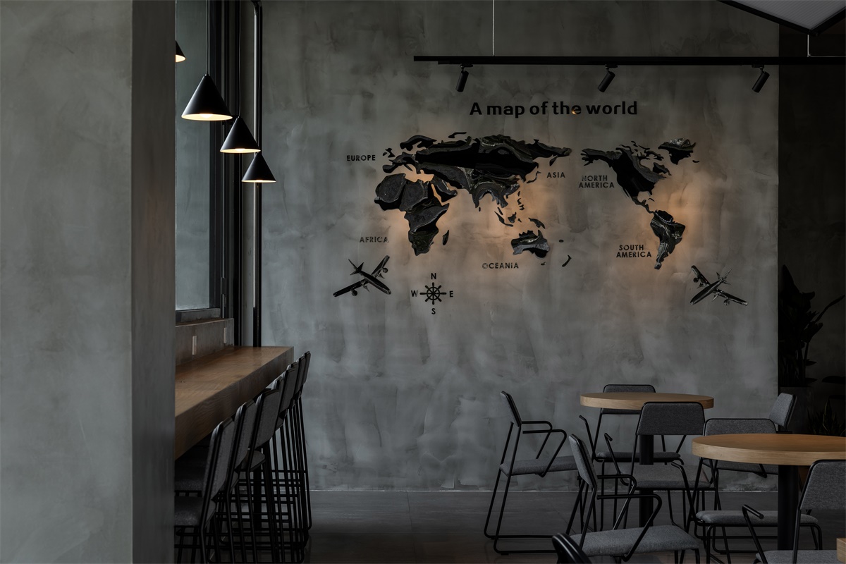
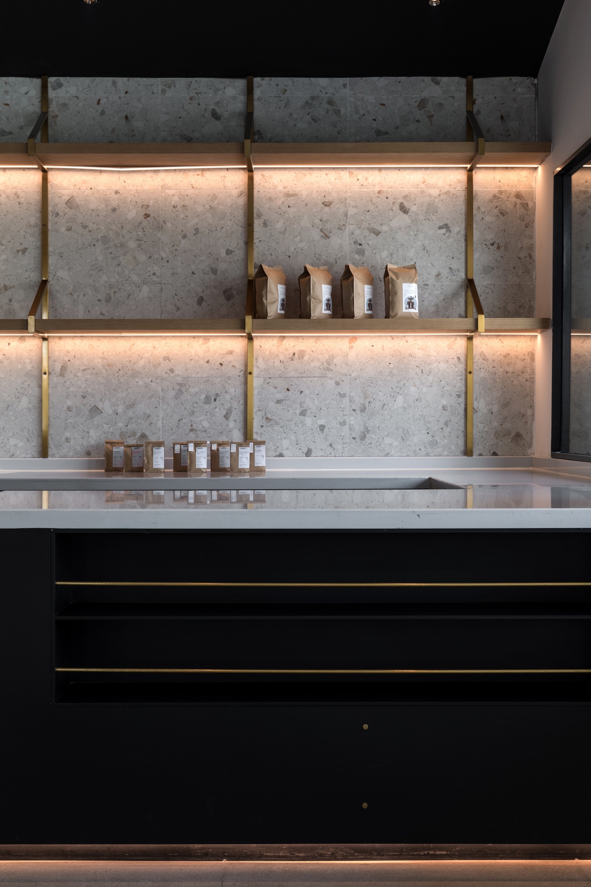
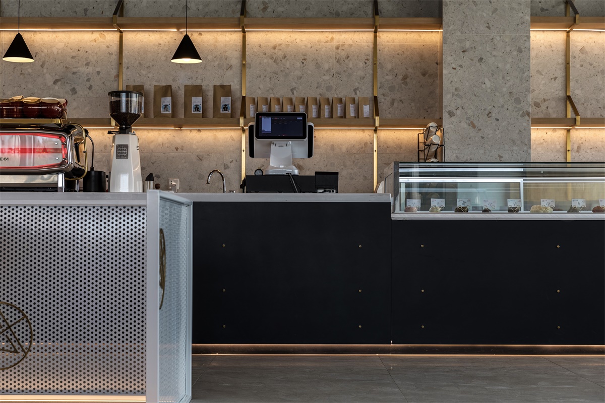
此次项目坐落在成都金堂耍都,咖啡厅的地理位置极佳,处在园区的拐角,我们希望做的是,通过设计,在原来的基础上增加新的元素,创新和变革。
Located at the entertainment city in Jintang, Chengdu, the cafe embraces a favorable location at the corner of the park. We hope to add new elements and to make innovations and revolutions through our design.
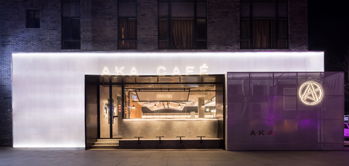
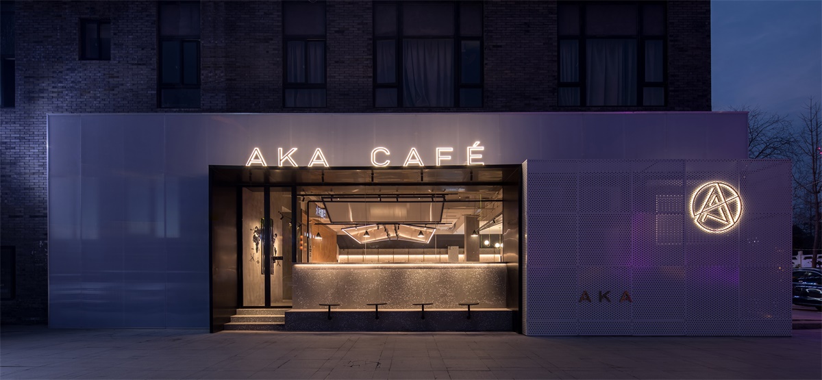
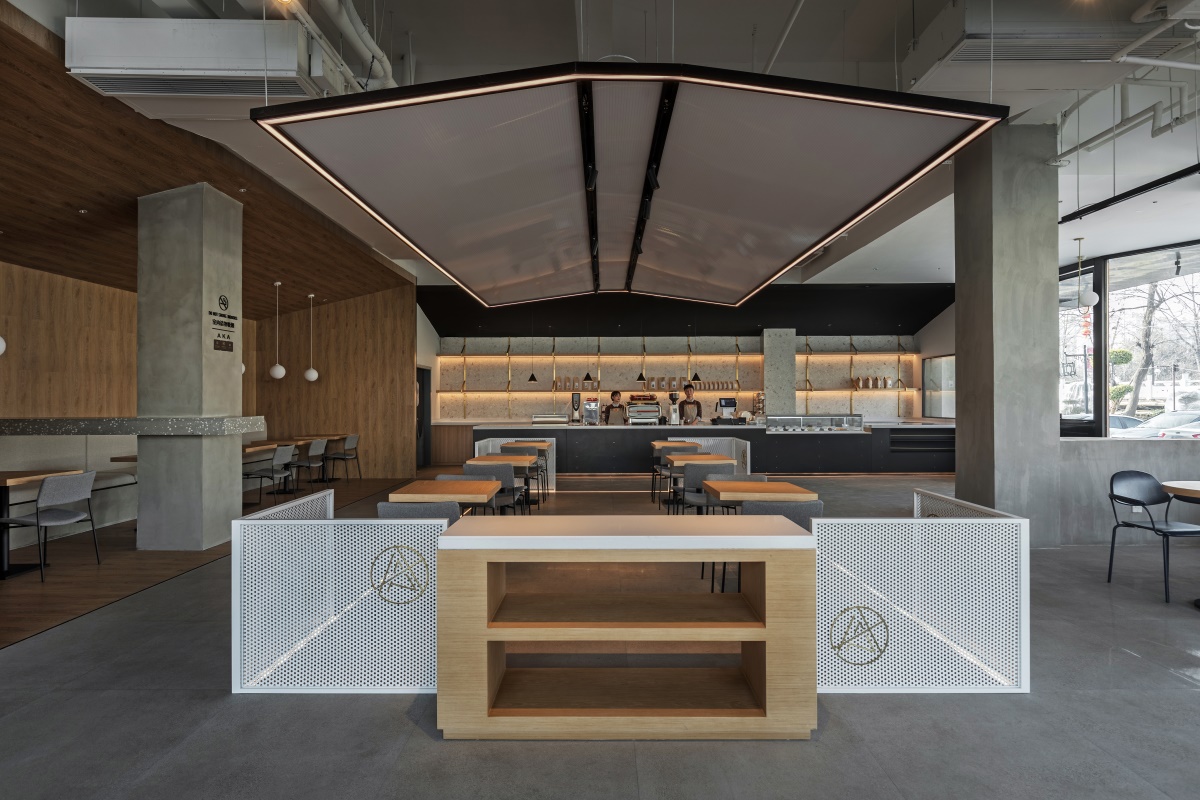
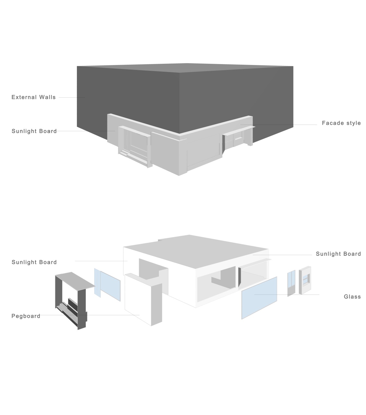
立方体的构成,双面对称且垂直,在常态下增加其高度,向内或向外的延伸变化而成。通过色彩,质感,材料而进一步区别;因此外立面选取了与周围灰色建筑物对比鲜明的半透光阳光板。纯白,简约的材质也给灯光提供了一个比较好的载体。
The symmetrical and vertical composition of the cube changes by stretching inward or outward by increasing its height in the normal status.Further differences are made by colors, textures, and materials.Therefore, the fa?ade consists of a translucent solar panel which contrasts with the surrounding gray buildings.The pure white and simple material serves as a marvelous carrier for the light.
户外空间 Outdoor space
一米三的吧台与室外座椅形成高度差,将公共空间与建筑后方的吧台联系了起来,增强了彼此间的互动性,也保留了室内与室外的隐私性。
The 1.3-meter-high bar and outdoor seats, which see the difference in height and links the public space to the bar, enhance their interactivity and preserves privacy both indoors and outdoors.
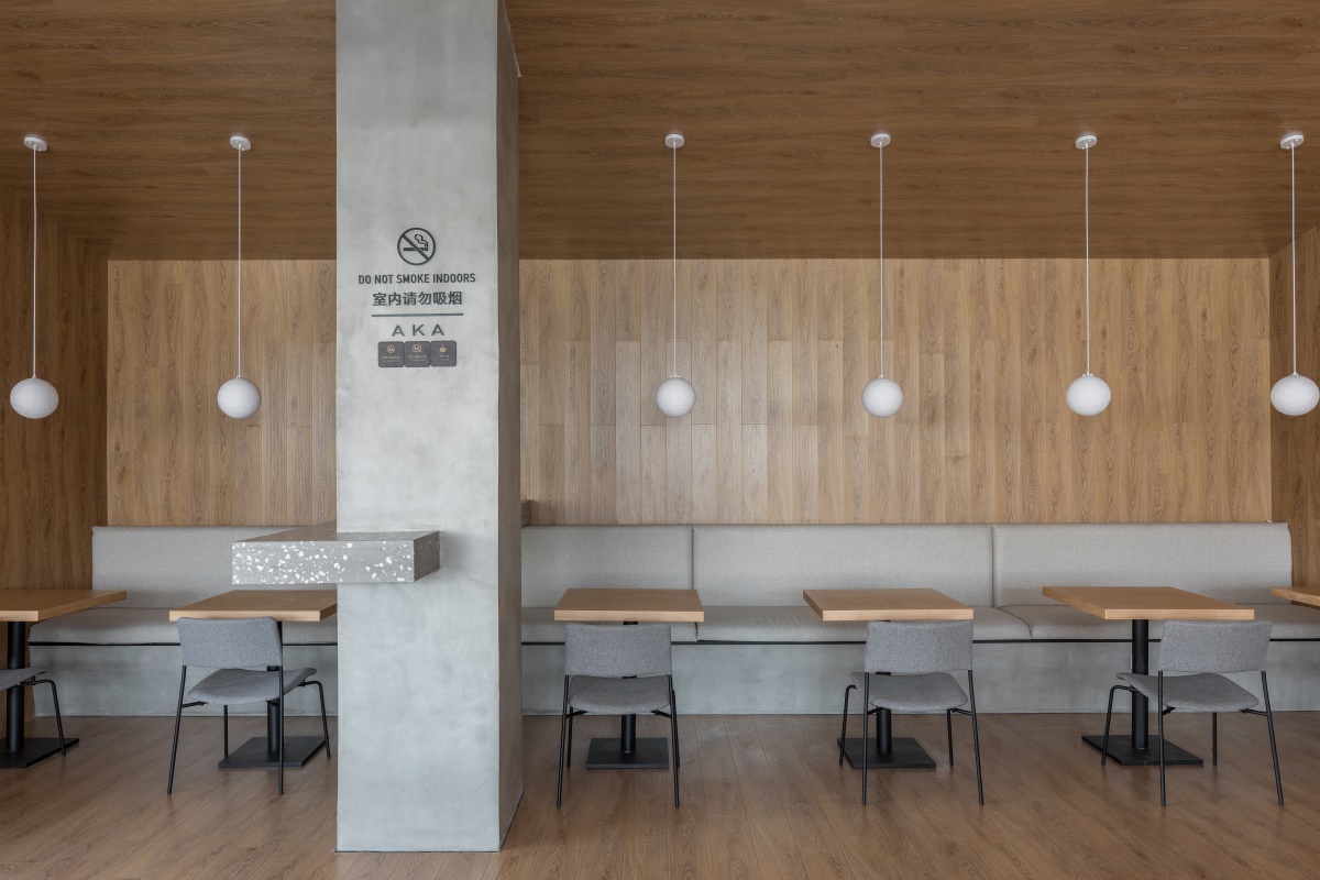
正门内退用几何形态展开,作为视觉的主导中心点。在这里形成一个带有屋檐的吸烟区,材质与室内统一,成为空间感受的一部分,形成很好的被接纳状态。
Pushing the main gate inward, there is a geometrical form as the dominant visual center.There is a smoking area with eaves matching well with the room, ?whose material is unified with that of the room and which becomes part of the space.
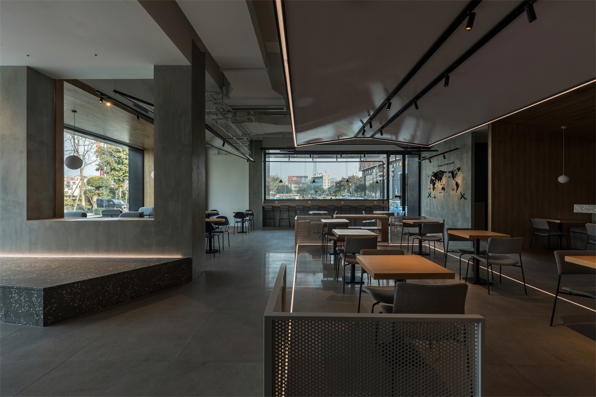
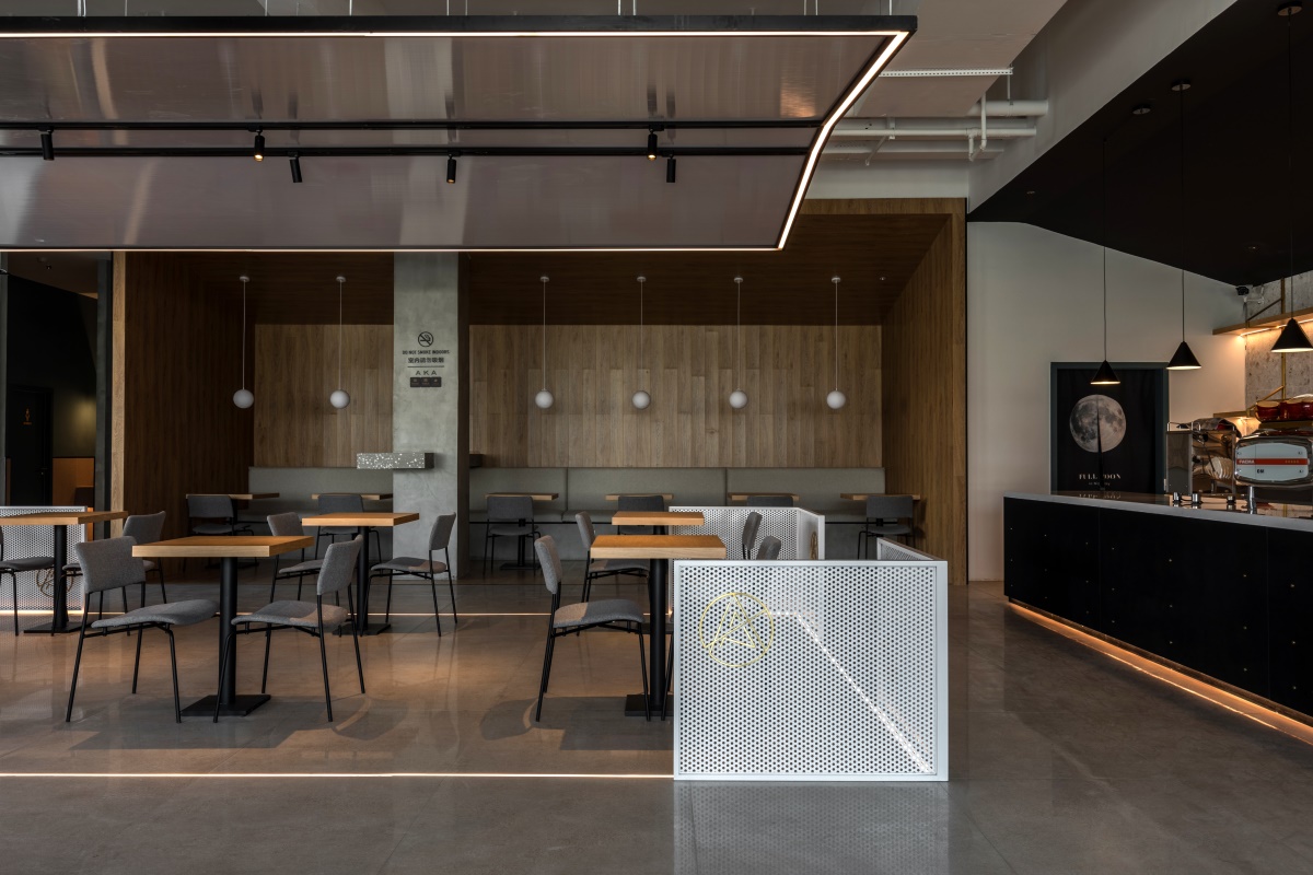
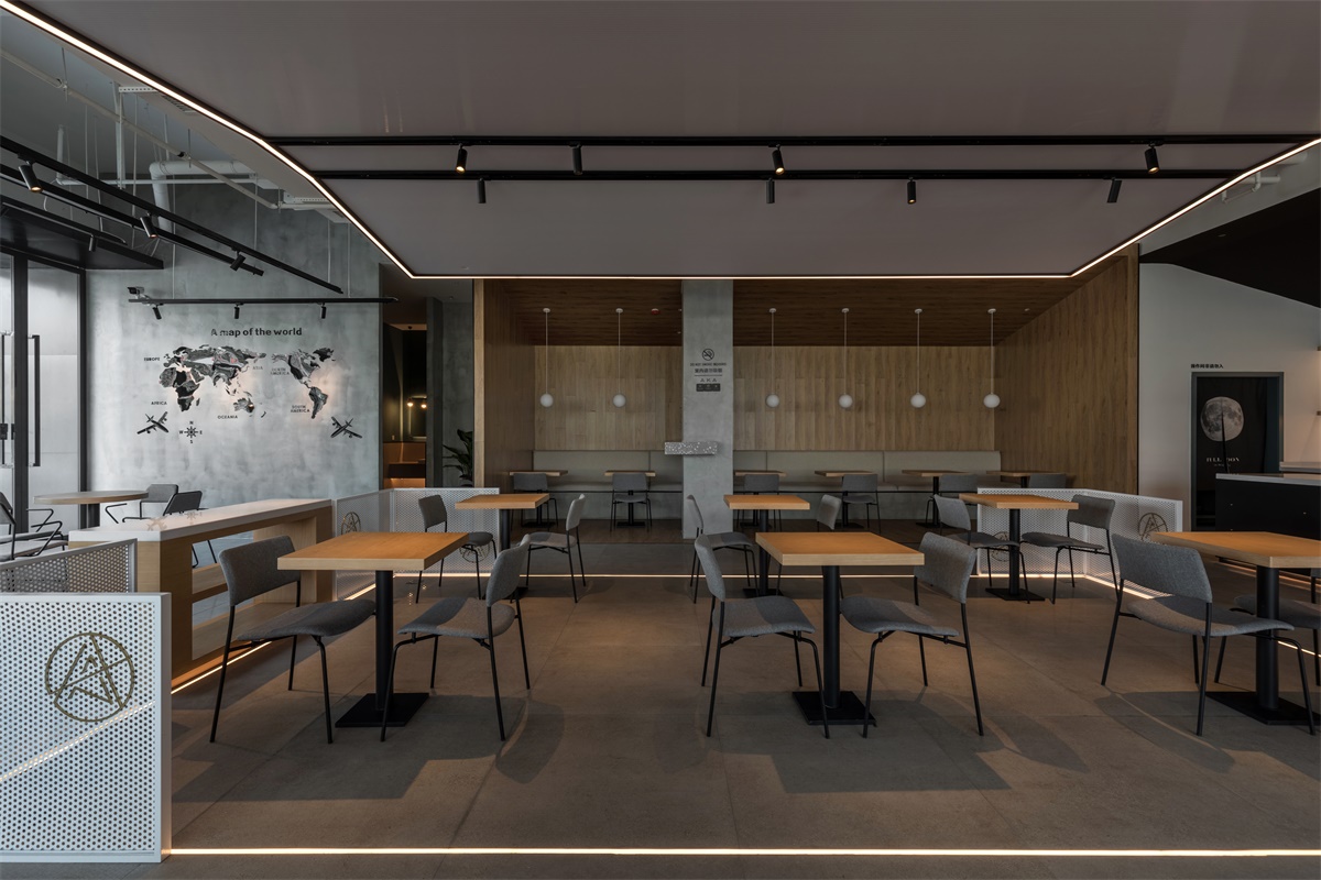
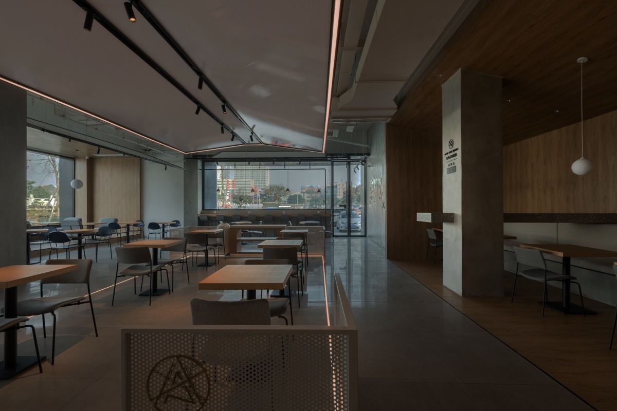
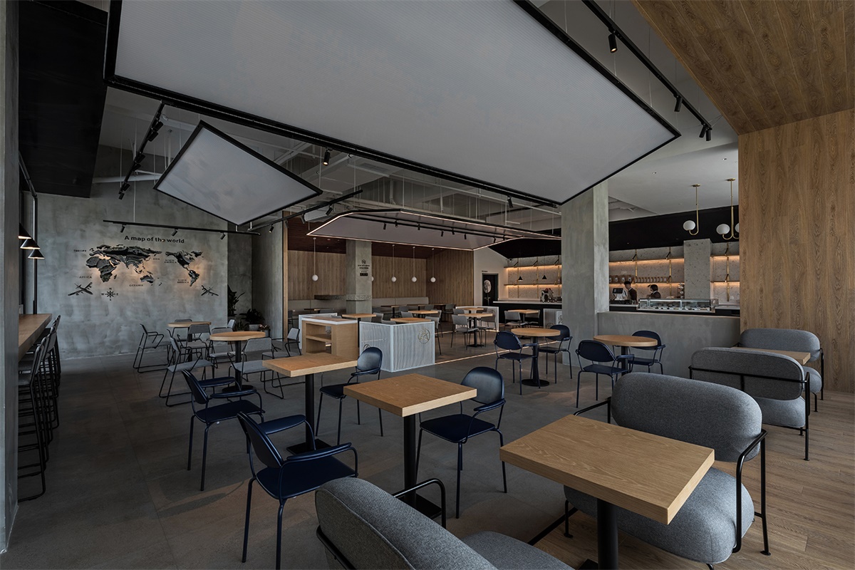
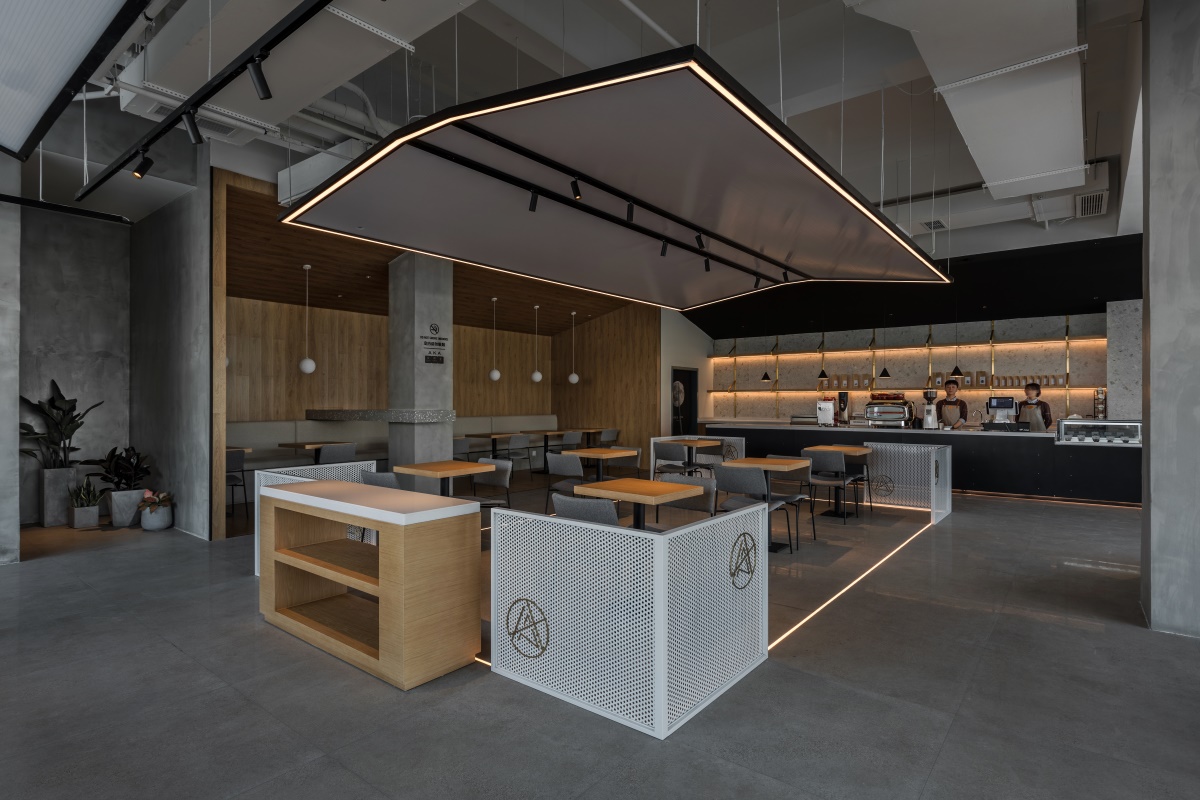
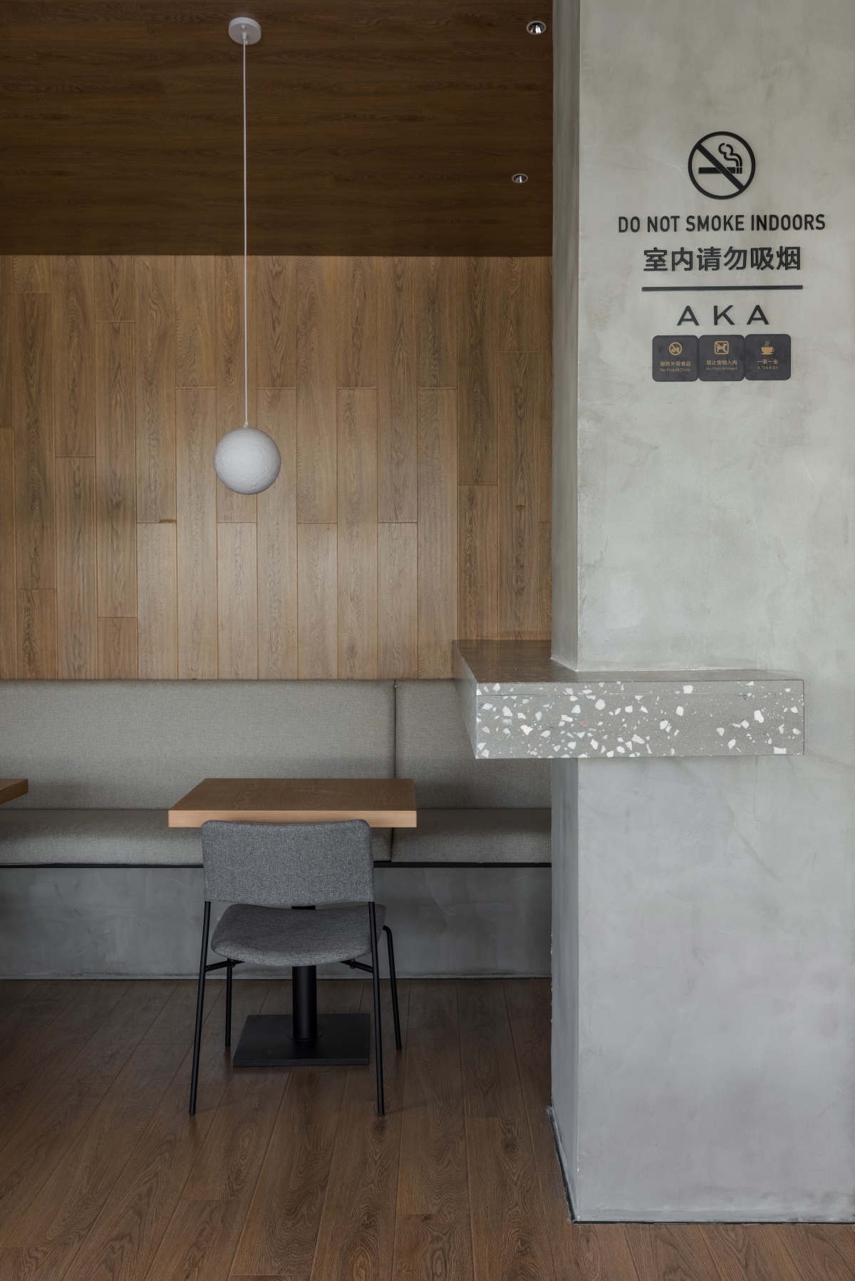
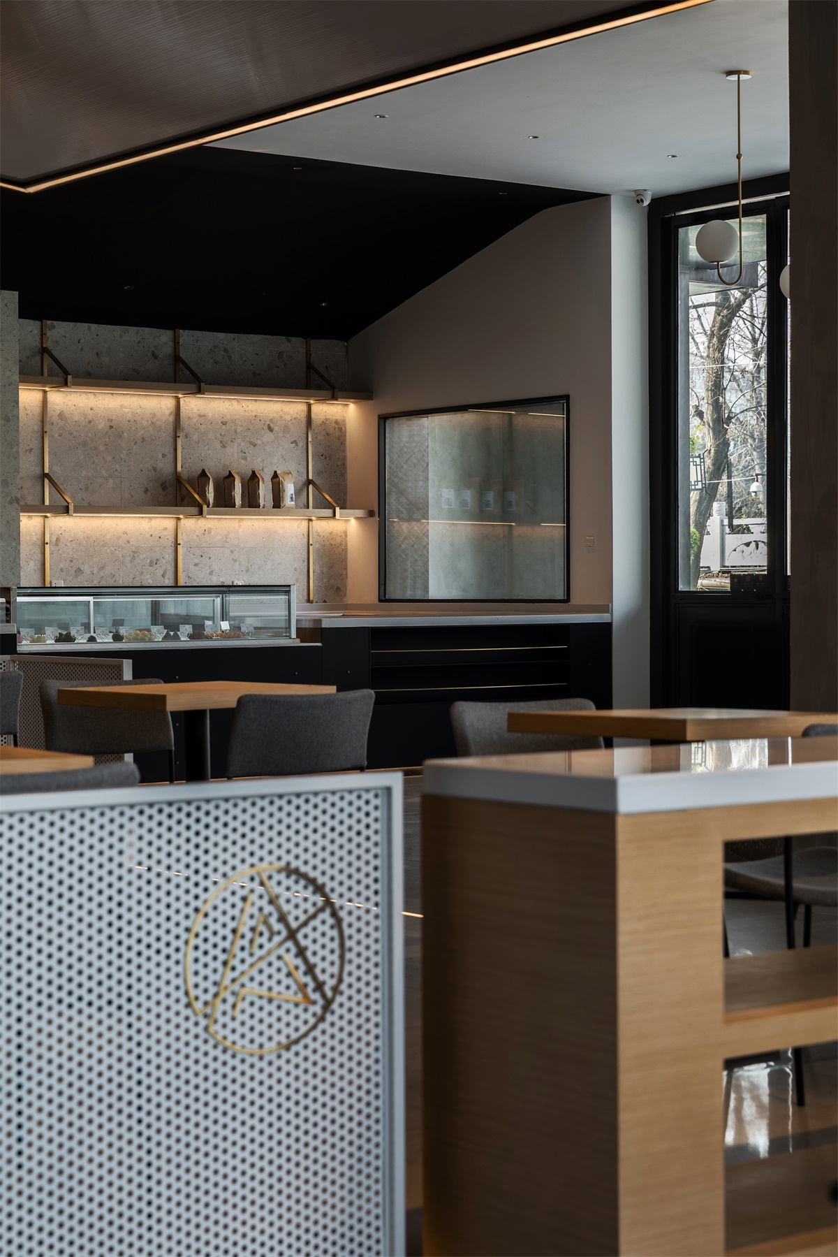
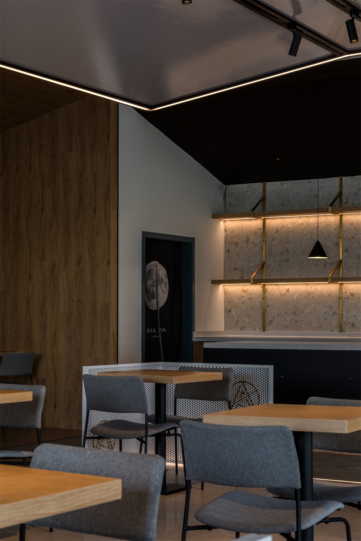
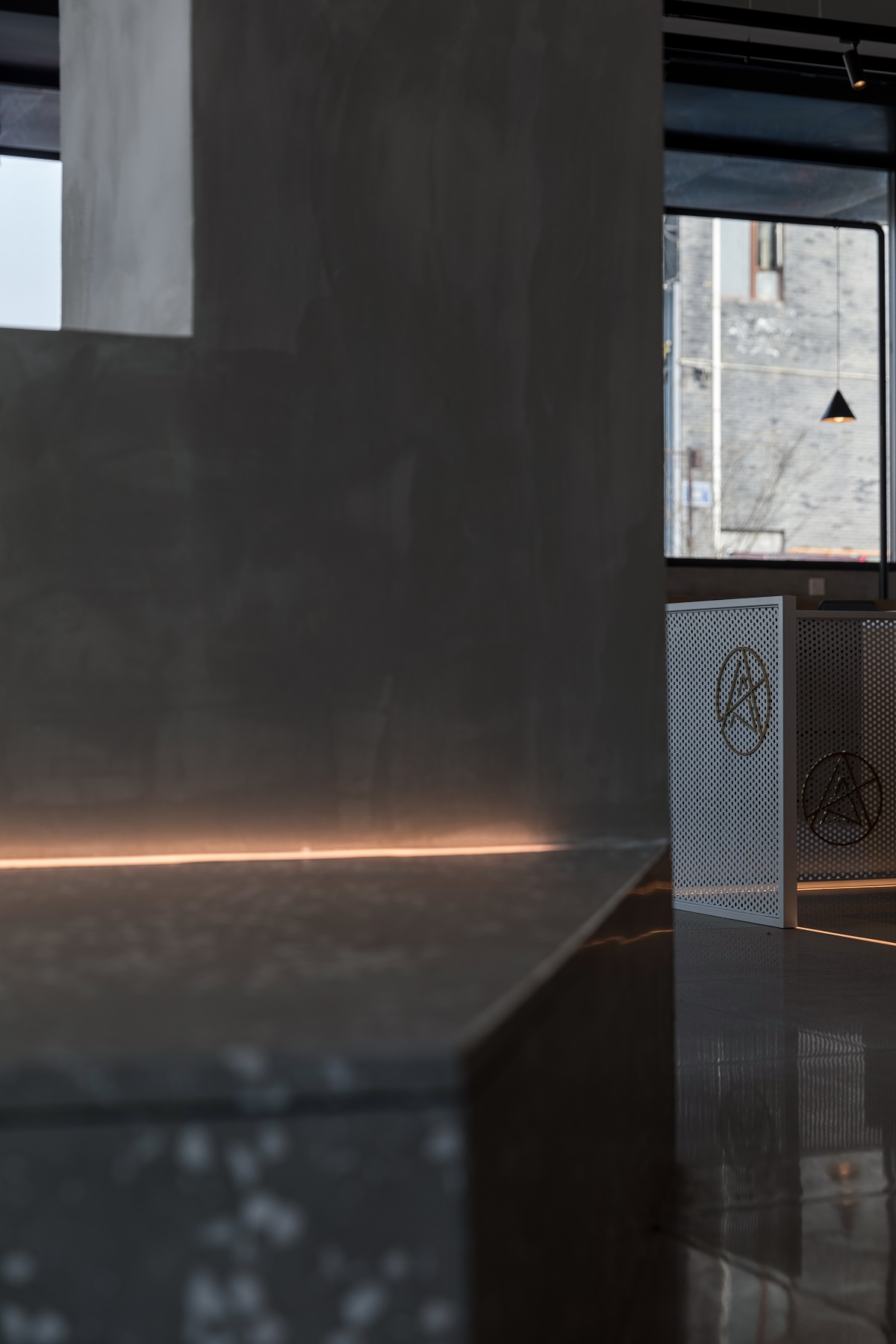
阳光板灯带与地面灯带给空间做了一个界限,不同的座位为不同需求的人们提供了可选择的空间。
A limit is formed by the hollow sheet strips and floor-lamp zones in the space.Different seats provide alternative space to people with different demands.
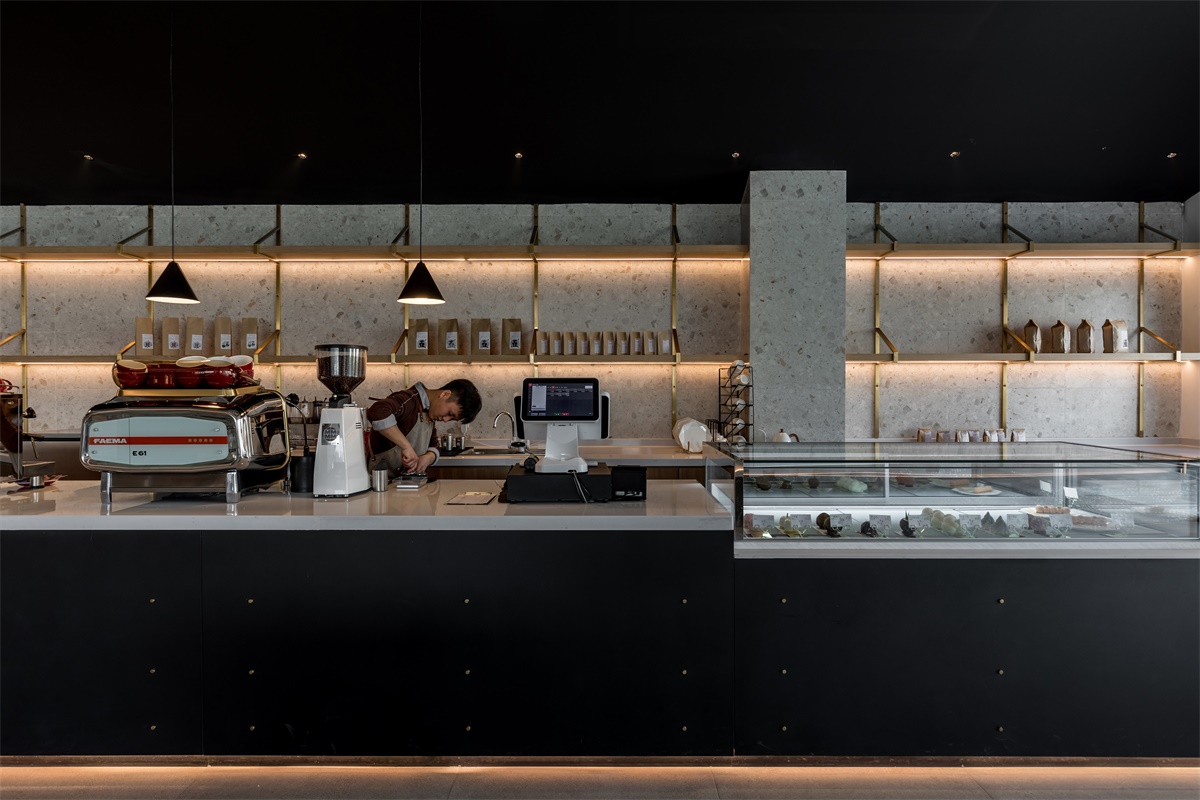
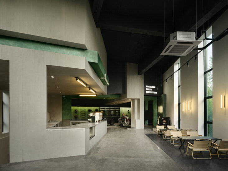
确保一切都是连通的的前提下,将空间体量分散开来,以保证其各自的私密性。
Space is divided into pieces to ensure the privacy of each part on the basis of all-around connectivity.
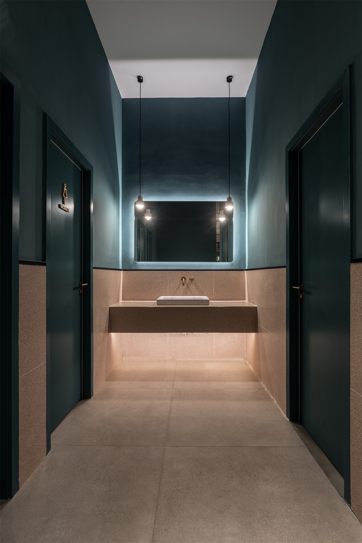
卫生间脱离了店内性冷淡的风格,用墨绿色与淡粉色做了大胆的撞色。
Contrast color with dark green and pale pink is adopted in the restroom which is free of sexually-coldness of the cafe.
完整项目信息
项目名称:AKA CAFÉ
设计公司:季意空间设计
联系邮箱:lijia@cdgedesign.com
完成年份:2019年1月
建筑面积:270平方米/坪
项目位置:中国,四川,成都金堂
摄影师:季光
Project Information
Designer in Charge: GE : STUDIO
Location: Chengdu, Sichuan
Area: 270 sqm
Project Year: 2019

