项目位于上海南外滩板块的老码头园区,老上海经典石库门建筑。
The project is located in the old dock park of the shanghai, Classic Shikumen building in old Shanghai
因项目空间较狭小,但设计师希望大家能在现代极简的框架内体验到中式独有的空间节奏感,整体空间框架以一层经楼梯进入二层公共空间,再进小空间的‘缩缩放再缩’的节奏而演变过来的。摒弃了繁琐和装饰。
Due to the narrow space of the project, the designer hopes that everyone can experience the unique sense of space rhythm of Chinese style in the modern minimalist frame. The overall space framework is evolved by the rhythm of “zooming and zooming” from the first floor to the public space on second floor through the stairway, and then into the small space to get rid of triviality and adornment.
以灰白为主色,再结合红铜与原木,使整个空间会更温柔而又静谧。每部分颜色自然过渡,协调统一,降低了对人们的视觉刺激。一层空间部分区域,提炼一个纯白色的独立吧台构建体,白色给人一种专业性以及可以使茶叶色泽度最原始的表达出来,空间更有趣味性。
Combining red copper and log with off-white as the dominant tone makes whole space more tender and quieter. Each part of the natural color transition, harmony and unity reduces the visual stimulation of people. In part of the space on the first floor, a pure white independent bar structure is refined. White gives people a kind of professionalism and make tea degrees express the original color and space more entertaining.
灰白、极简的空间与厚重、沧桑、灰暗的旧物件形成气质上的反差,新的更新、老的更老,拉开时间上的层叠。
Off-white, minimal space and massiness, vicissitude, gloomy old things form a contrast in temperament, which makes the new newer, the old older and stretches the cascades of time.
二楼的空间设计理念主要是参考中式特有的庭院、中堂、厢房为基础理念进行空间演变。
The space design concept of the second floor mainly refers to the unique Chinese courtyard, atrium and wing as the basis of the concept of space evolution.
三间茶艺空间的风格也略有不同,和式、藏式、现代,也是结合消费群体的习惯及归属感来进行了积极的融合,增强体验感。
The styles of the three tea art Spaces are also slightly different. It includes kimono, Tibetan and modern. They are also combined with the habits and sense of belonging of consumer groups to carry out positive integration and enhance the sense of experience.
整个空间使用大量框景,将远处的立面造型选择性的取景出来与近处的立面造型相结合,使整个空间具有延展性。
The whole space uses a large number of enframed scenery which combines the distanced and the close façade, so that the whole space has the ductility.
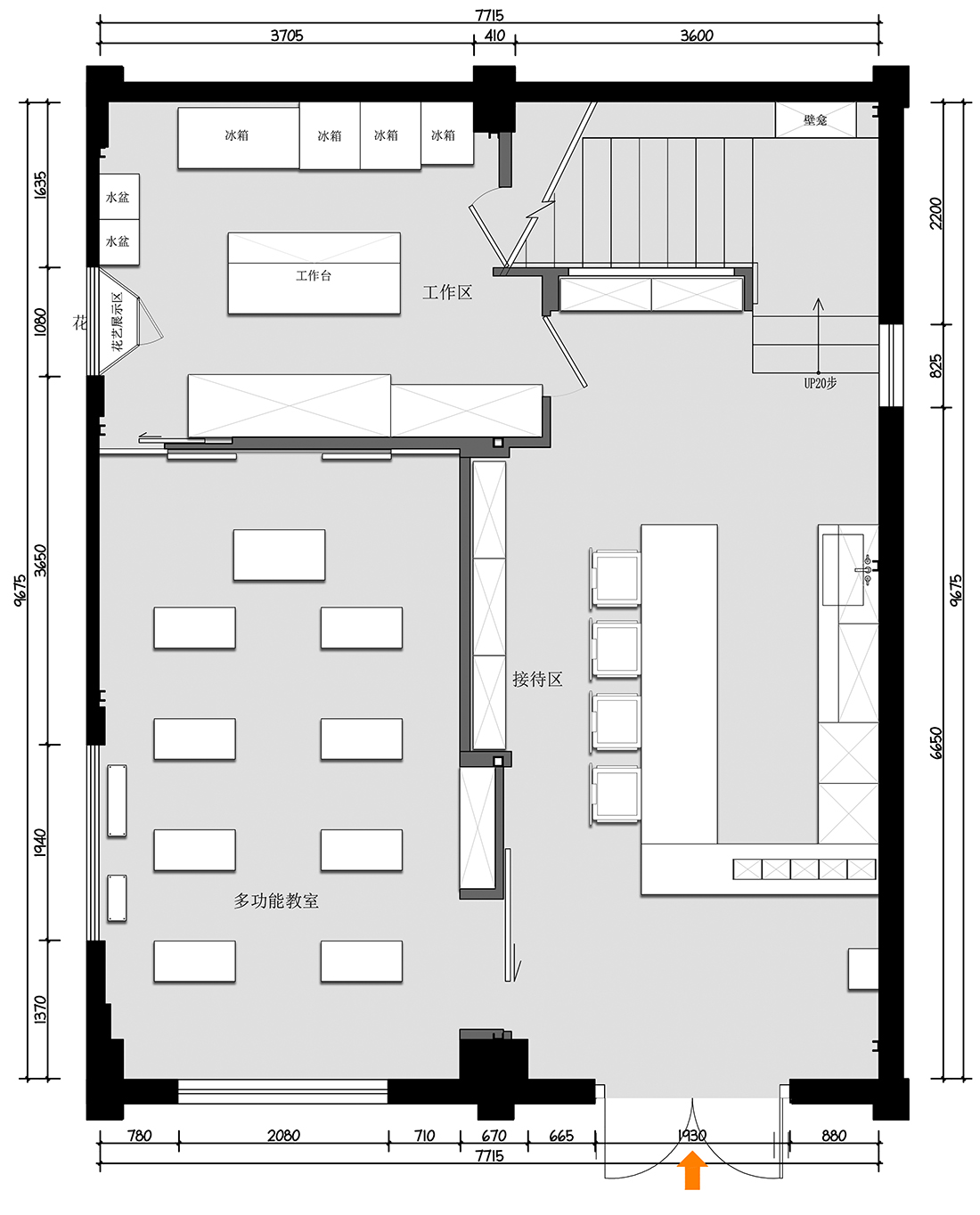
∇ 一层平面布置图
∇ 二层平面布置图
∇ 剖立面
项目信息
项目名称:地山公社
设计时间:2019.6
竣工时间:2019.10
项目面积:150平方
项目地点: 上海市外滩老码头
设计公司:上海哲本建筑设计事务所
全案设计:郑哲
参与设计:Liz(李霁娴)袁超 刘洋
后期摄影: Archtric Image
整体撰文:郑哲
Project Name: Dishan Commune
Design time: 2019.6
Completion time: 2019.10Project area: 150 square meters
Project location: Shanghai Bund Old Wharf
Design company: Shanghai Z-STUDIO
Design of the whole case: ZERIC
Participated in the design: Liz, Yuan Chao, Liu Yang
Post-photograph: Archtric Image
Overall writing: ZERIC
相关文章推荐






评论(0)