全球设计风向感谢来自 Oft Interiors Ltd 的车库空间项目案例分享:
OFT设计丨车库3.0时代:跑车博物馆x社交场景
E CARPARK是为跑车狂热爱好者设计的车库,对爱好者而言,跑车不仅是交通工具和艺术品,还代表着内心的自由与冒险,这个车库所展示与强调的便是车带来的流动的自由。
如何把幽暗封闭的车库变成未来感跑车博物馆?
E CARPARK is a garage designed for sports car enthusiasts. For enthusiasts, sports cars are not only means of transportation and artwork, but also represent the freedom and adventure inside, and what this garage shows and emphasizes is the freedom of mobility brought by cars.
How to make the dark closed garage into a futuristic sports car museum?
OFT设计以“科技·流动·自由·社交”四个关键词为概念,在地面与天花上以大量的直线与曲线,模拟车辆在道路上的疾驰状态,将其行驶动态一直延续在这流动的体验式场景中,象征着永不停止的冒险之旅。
这里,不是终点而是起点。
OFT chooses four key words as the concept of design:”technology·flow·freedom·future”. A large number of straight lines and curves on the ground and ceiling simulates the speeding state of vehicles on the road, which enables the driving dynamics to be continued in this flowing space, symbolizing the never-ending adventure.
This is not the end, but the starting point.
1 自由与冒险的起点 The starting point of freedom and adventure
该项目在改造前是香港铜锣湾商业大厦配套车库,业主买下后作为私人车库使用,虽是私人车库,但面积足足有1000㎡。
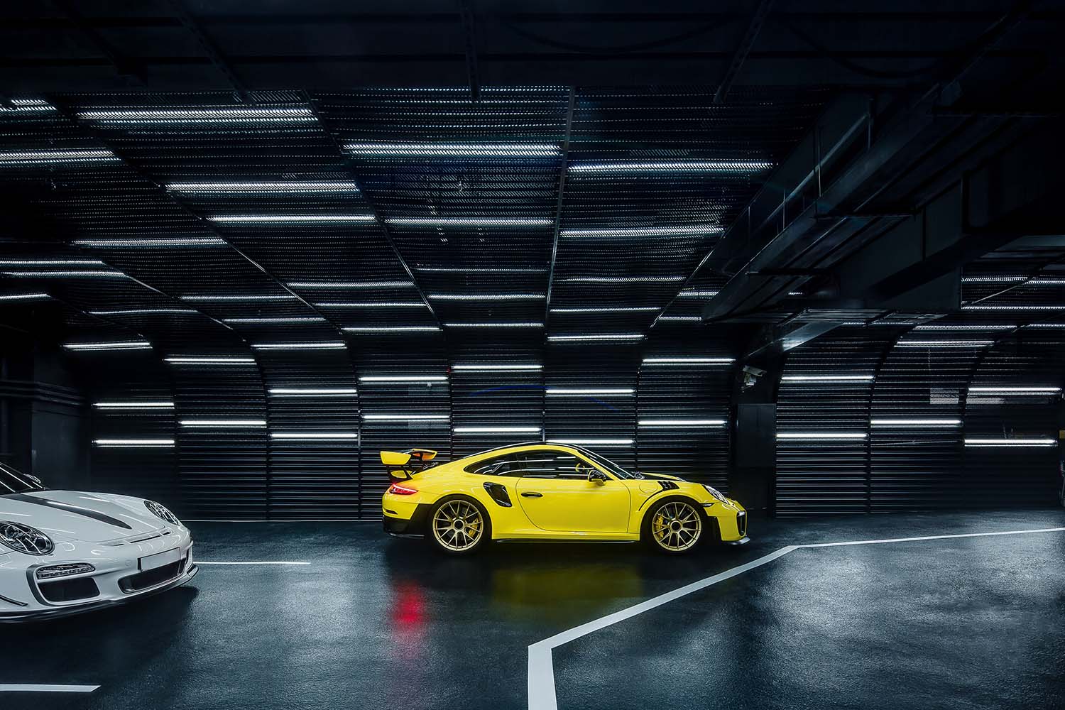
考虑到业主跑车爱好者的身份,以及为凸显车在空间中绝对主角的身份,设计师在这个1000㎡的车库仅设置了28个车位,车位尺寸也也略大于常规,就从展示这一层面来说,E CARPARK可以说是一座名副其实的微型跑车博物馆。
The project was a supporting garage for the Causeway Bay commercial building in Hong Kong before the renovation, and the owner bought it as a private garage, although it is a private garage, the area is fully 1000 square meters.
Taking into account the owner’s identity of sports car enthusiast, as well as to highlight the identity of the absolute protagonist of the car in the space, the designer set up only 28 parking spaces in this 1,000 ㎡ garage, and the size of the parking spaces is also slightly larger than conventional. In terms of displaying, E CARPARK can be said to be a veritable miniature museum of sports cars.
设计时,OFT保留了其原始结构,将重点放在导视、照明、墙面、色彩等维度进行改造。
When designing, OFT kept its original structure and focused on the dimensions of guidance, lighting, walls and colors for renovation.
入口处承担着业主对车库的第一印象的作用,为增强序列化的仪式感,设计师为车库设计了独有的LOGO,并用连续的LED灯带创造出空间的无限延伸感,LOGO既作为独特的空间标志,又成为引导性照明,指引着车主进入,提升车主内心归属感。
The entrance assumes the role of the owner’s first impression of the garage. To enhance the sense of serialization ritual, the designer designed a unique LOGO for the garage and created a sense of infinite extension of the space with continuous LED light strips. The LOGO serves both as a unique space mark and as guiding lighting, directing the owner to enter and enhancing the owner’s inner sense of belonging.
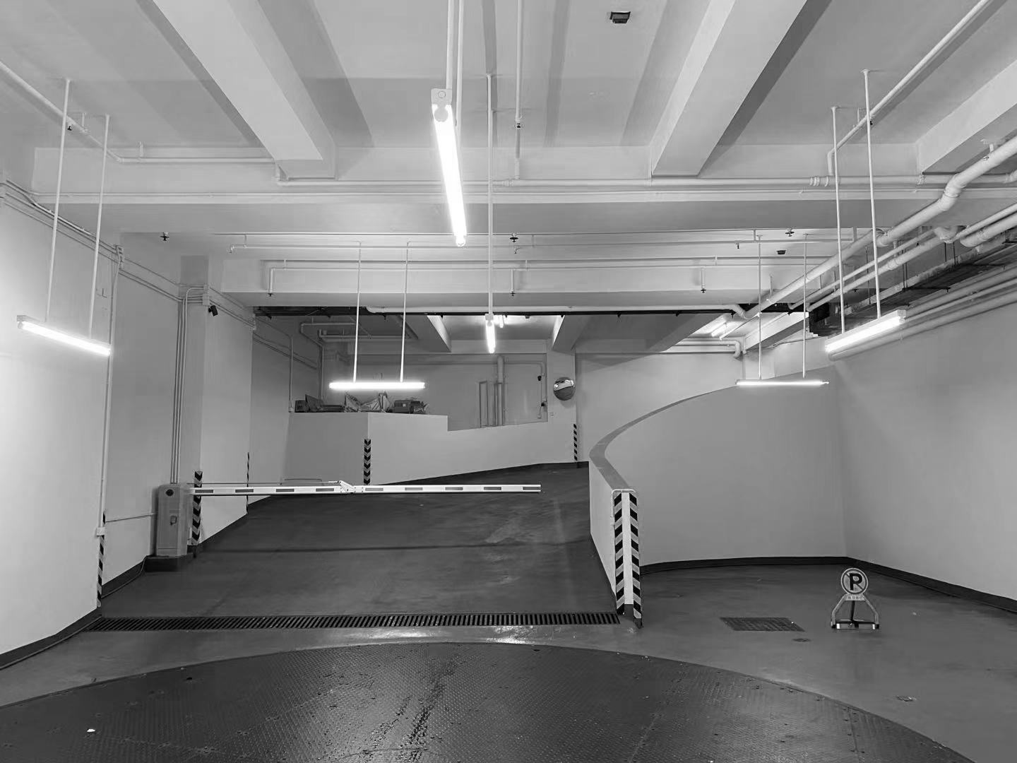
车库坡道是车库设计的重点之一,作为车辆驶入地库的必经之道与第一空间节点,其性能优劣,直接影响出入口的安全指数。
因此在设计上,首先坡度必须足够小(兰博基尼不碰底盘);同时还要防滑防震降噪;除此之外,还要防眩目以减少出入地库的视觉刺激。
Garage ramp is one of the key points of garage design. As the necessary way and the first space that vehicles entering into the basement, its performance directly affects the safety index of the entrance and exit.
Therefore, in the design, the slope must be small enough (Lamborghini does not touch the underpan); at the same time, it also need to be anti-slip, anti-vibration and noise reduction. In addition, anti-glare to reduce the visual stimulation when in and out of the basement is necessary.
2 流动的空间感:人性化向导标识 A sense of flowing space: humanized guide signs
如今LED灯具已逐步取代传统荧光灯成为未来趋势。
Nowadays, LED lamps and lanterns have gradually replaced traditional fluorescent lamps as the future trend.
在该项目中,OFT使用了大量为车库专门定制的LED照明灯具,在增强空间通透性与明亮度的同时,也打破传统单一照顶部聚焦式照明方式,变成从顶部到墙面的局部漫射式照明,把原本促狭静止的车库,变成一个自由流动的博物馆。
In this project, OFT used a large number of customized LED lighting fixtures for the garage to enhance the transparency and brightness of the space, while also breaking the traditional single top-focused lighting method into local diffuse lighting from the top to the wall, turning the originally cramped and static garage into a free-flowing museum.
整体色调与氛围上,OFT选择了更为中性与科技的视觉方式呈现,入口处的墙面利落的冷色调条状灯与平面元素刻意弱化色彩所带来的对视线的争夺。
In the aspect of the overall color and atmosphere, OFT chose a more neutral and technological visual presentation. The sharp cool color strip lights and flat elements of the entrance wall deliberately weaken the color brought about by the competition for the line of sight.
除了颜值能打之外,这些定制灯具还承担着另外一个重要作用:导视系统与空间分区。
导视系统主要由墙面的导视标识与地面部位的车行划线共同构成。
In addition to the appearance attractiveness, these customized lamps also assume another important role: the guidance system and space zoning.
The guidance system is mainly composed of the guide signs on the wall and the car line marking of the ground part together.
分区则由几个表面共同完成,车库分为ABCD四个区域,设计师通过墙面、地面、天花对四个区域进行软性隔断。(此次为ABCD四个区域,通过拼图体现墙面、地面、天花的不同)
天花:
改造前:管道与出风管道裸露在外,看起来杂乱无章,顶部灯光为白色荧光灯,整体氛围感弱。
The partition is completed by several surfaces together. The garage is divided into four areas of A,B,C and D, and the designer softly partitions the four areas through walls, floors and ceilings. (In the four areas, the difference between the wall, floor and ceiling are reflected through the jigsaw.)
Ceiling:
Before remodeling: the ducts were exposed and looked disorganized, the top light was white fluorescent, with overall weak atmosphere.
改造后:出风口被藏于天花之上,并定制线性、带状及圈状灯具,在创造空间分区的效果的同时也成为空间的景观。
墙面:
改造前:墙面是车库最常规的乳胶漆白墙,不耐脏且过于普通,当那些价值不菲的艺术品在此停泊时,无论多出色的外观与性能都只能流连在着平庸的场景中。
After remodeling: The air vents are hidden above the ceiling, and custom linear, ribbon and circle light fixtures are made to create the effect of space zoning while also becoming the landscape of the space.
Walls:
Before: The walls were the most conventional latex painted white walls of the garage, which were not durable and too common. When those valuable artworks were parked here, no matter how outstanding the appearance and performance, they could only linger in the mediocre scene.
改造后:铝合金装饰板加发光LED导视,带来移步换景的视觉体验。
地面:
改造前:大面积的灰色地坪漆,易产生视觉疲劳,且地面车行划线不清晰,导致车辆在车库中迷失。
After: aluminum alloy decorative plate and luminous LED guide bring a visual experience of moving and changing the scenery.
Flooring:
Before: large area of gray floor paint can easily produce visual fatigue, and the ground car line is not clear, resulting in vehicles’lost in the garage.
改造后:地面利用平面元素搭配整个空间主题以及分区效果,并定制带有项目logo的地漏,用细节连接起空间、车库与人之间的关系。
After: The floor uses flat elements to match the theme of the whole space as well as the zoning effect, and custom-made floor drains with logo of the project, connecting the relationship between the space, garage and people with details.
3 车库3.0时代:跑车博物馆+社交场景
Garage 3.0 era: sports car museum + social scene
除了重新规划动线,OFT设计还提出以“跑车博物馆+社交场景”的概念,重新定义车库,让更多冒险艺术家能够在这个空间中交流、对话,创造人与车之间以及人与人之间的共鸣。
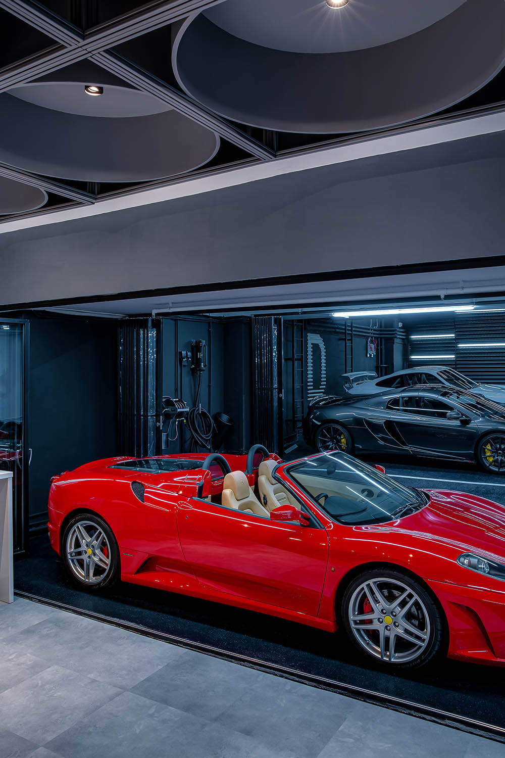
设计师在“跑车博物馆”中开辟出一个全新社交空间,通过区别于其他区域的聚合式天花与地面,设置出一个半开放式休闲区。
In addition to re-planning the moving line, OFT Design also proposed the concept of “Sports Car Museum + Social Scene” to redefine the garage, allowing more adventurous artists to communicate in this space, creating a resonance between people and cars as well as among people.
The designers have created a new social space in the “Sports Car Museum”, with a semi-open lounge area through a convergent ceiling and floor that is different from other areas.
仰望头顶上方,休闲区顶部做了圆形的吊灯装置,区别于停车区轻盈的线条感,休闲区厚重的灯具带来一种温暖与安全的包裹感,暖黄的光线也为这个社交空间创造出独具亲和力与无距离的空间氛围。
Looking up above the head, a round chandelier installation is made at the top of the lounge area. Unlike the light lines of the parking area, the heavy lamps in the lounge area bring a sense of warmth and security in the package, and the warm yellow light also creates a unique affinity and distance-free atmosphere for this social space.
当车友在此聚会聊天时,可以随心所欲走到任何一台艺术品前欣赏、凝视,也可以随时用行动去拥抱风和自由。
When car enthusiasts meet and chat here, they can walk to any piece of artwork to admire and gaze at it as they wish, and they can also embrace the wind and freedom with their actions at any time.
社交空间的出现,不仅丰富了车库的功能属性,也为单一的空间带来更多层次,让车库不再是单调的场景,而是充满了人性化的关怀。
E CARPARK颠覆了传统车库常见的“阴暗、潮湿”等被人诟病的印象,带来独具展示性、社交性、人性化的新风景,当这些移动的艺术品驶向此处时,轰鸣声、速度与激情都已散去,只剩无声与优雅。
The emergence of social space not only enriches the functional attributes of the garage, but also brings more layers to the single space, so that the garage is no longer a monotonous scene, but full of humanized care.
E CARPARK overturns the common impression of “dark and wet” of traditional garage, and brings a new landscape with unique display, socialization and humanization. When these mobile artworks are driven here, the roar, speed and passion have been dispersed, leaving only silence and elegance.
项目信息
项目名称:E CARPARK
设计公司:Oft Interiors Ltd
设计总监:邹卓明、张敬贵
设计团队:yoyo au
项目面积:1000平方米
项目地点:香港铜锣湾
设计时间:2020
施工时间:2021
项目摄影:hdp
Project Name:E CARPARK
Design Firm:Oft Interiors Ltd
Design Director:CM JAO, Ken Cheung
Design Team:yoyo au
Project Area:1000 sqm
Location:Causeway Bay, Hong Kong
Design Date:2020
Construction Period:2021
Project Photography:hdp
相关文章推荐











评论(0)